Operation Renovation
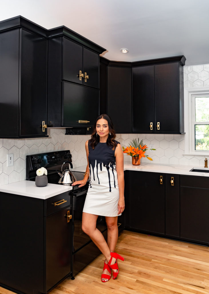
My motto has always been, “It’s not how big the house is; it’s how happy the home is.” Here’s the story of renovating our 1960s brick ranch!
17 years ago, I moved to Charleston, SC, from New York with my hubby Gus. We were sharing a 450 square foot studio apartment in Brooklyn and the only thing we fought about was not spending enough time together.
We moved into a 60’s brick ranch in an older neighborhood on James Island. 3 bedrooms, 2 1/2 bathrooms, and a big backyard was a huge change for us.
The house needed a lot of upgrades to modernize it to our standards, but we invested all of our money into our former boutique b’zar on King Street. 15 years later, we finally built the equity in our house and the savings to do our big remodel.
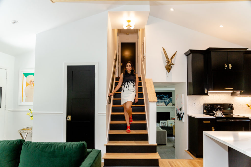
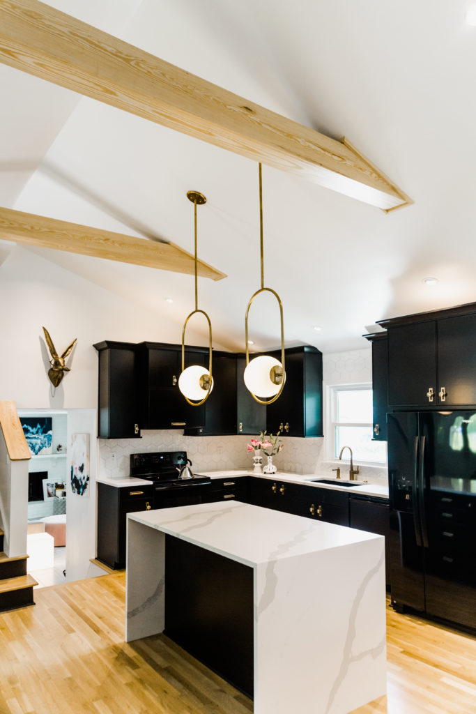
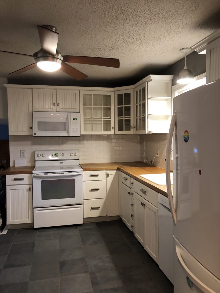
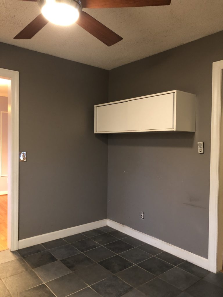
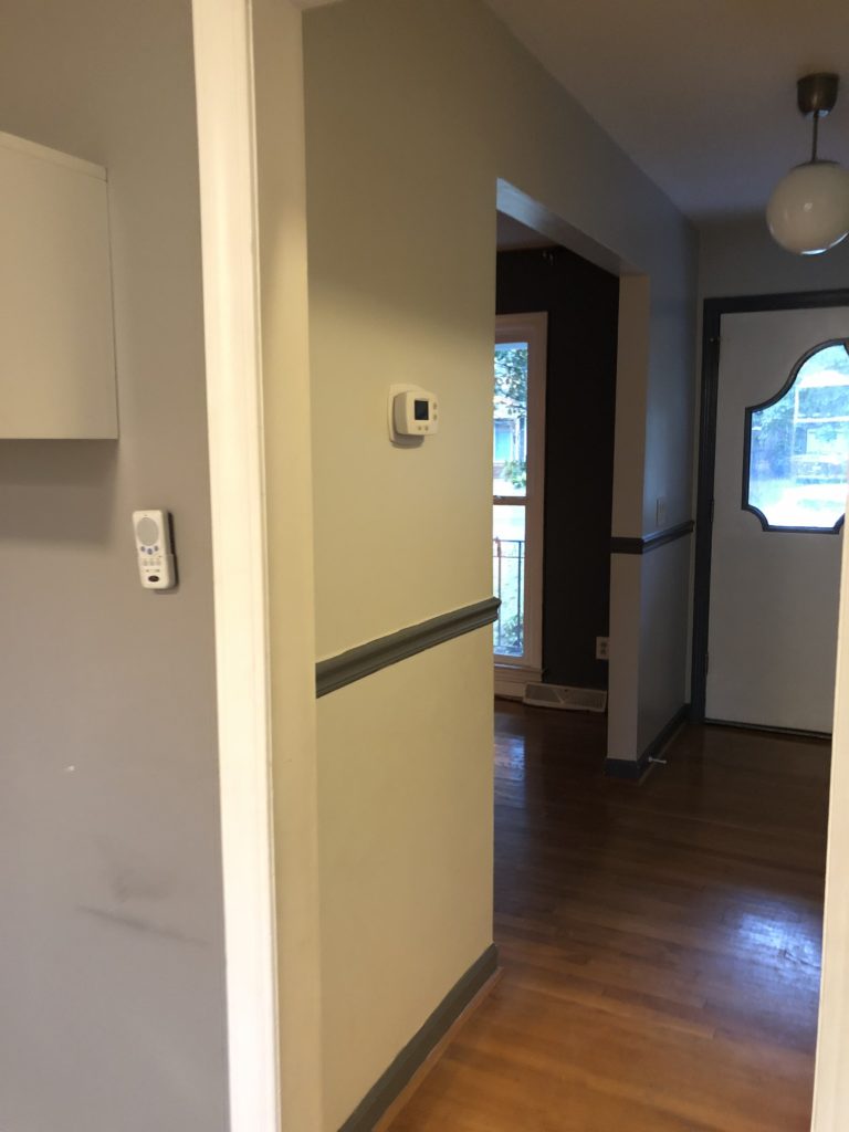
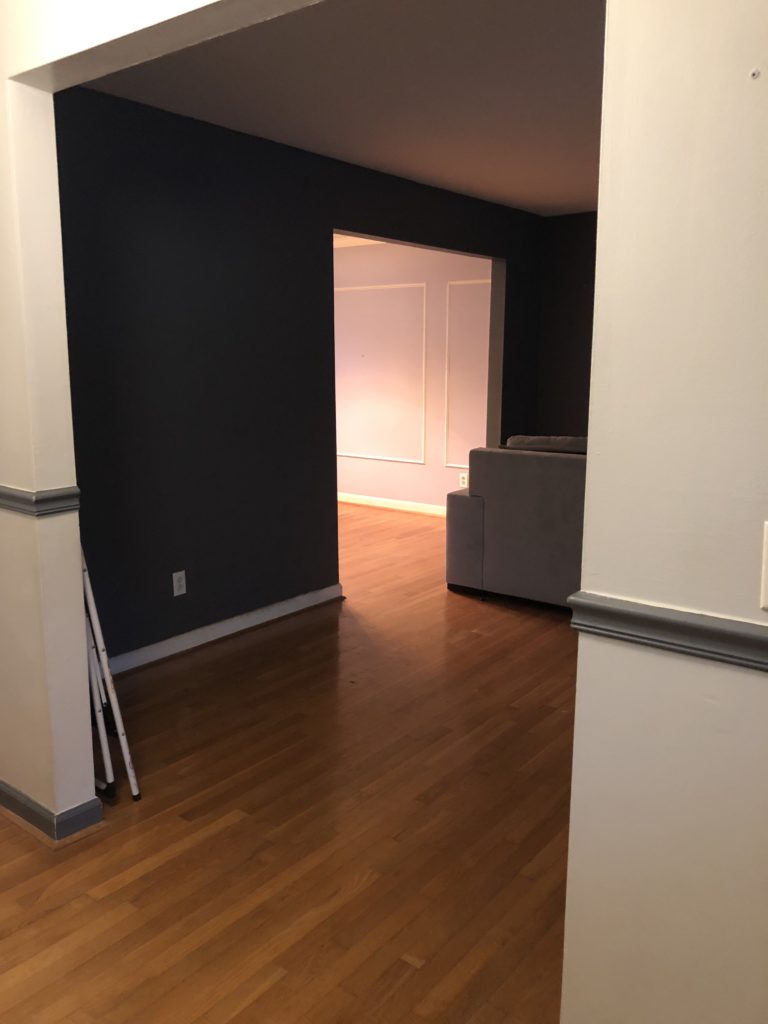
The biggest transformation was knocking down 4 walls downstairs that divided the kitchen, living room, and dining room. The contractor we used just happens to also be our neighbor. He had the vision to raise our low popcorn ceilings to a vaulted ceiling with beams. Our minds were blown!
Not only did he expand our space from wall to wall, but also floor to ceiling. Gus and I have always been fans of modern design so we never felt like our house fit our aesthetic, but we new it had potential.
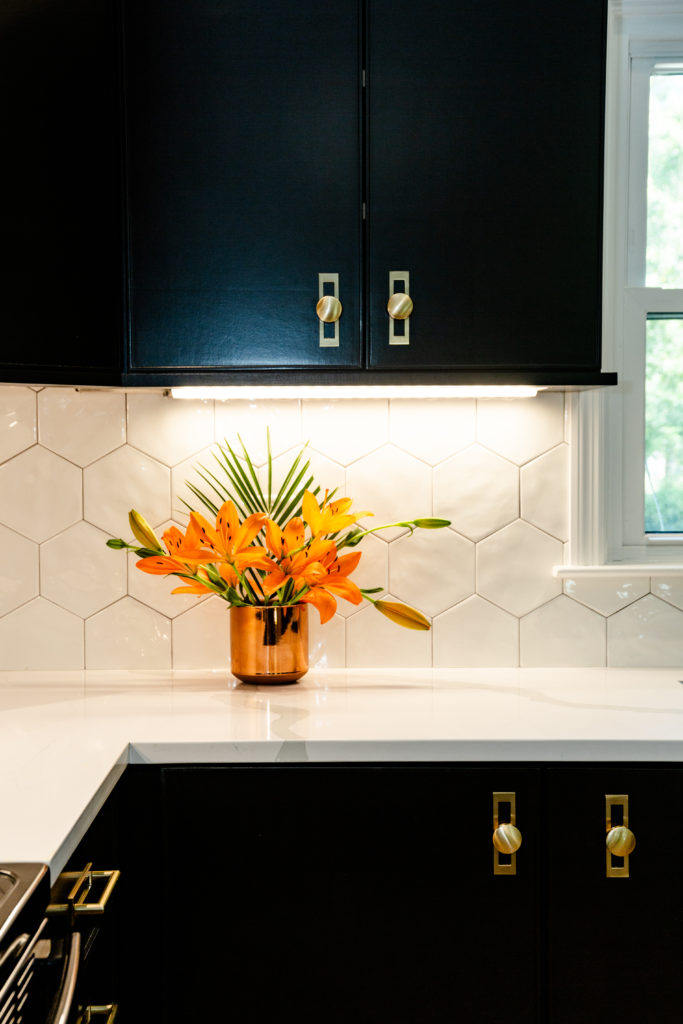
We knew we wanted brass fixtures throughout the house and this hardware from Top Knobs just spoke to us. The big graphic shape of the octagon white tiles from Garden State Tile against the black cabinets were the perfect touch.
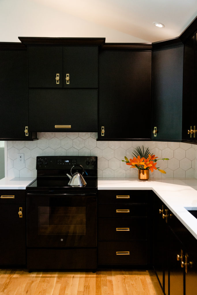
We love a bold, graphic design so we went with black cabinets in the kitchen and all of the doors throughout the house.
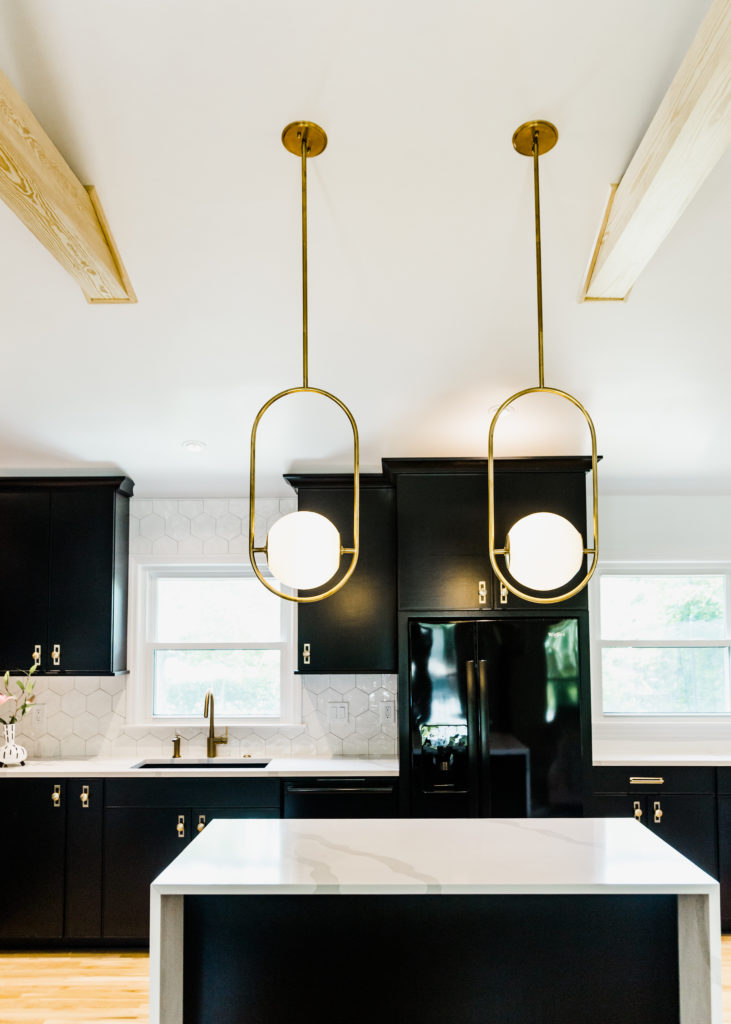
One of the hardest decisions we had to make was deciding on the light fixtures. It’s the focal point of the room and we really wanted to make a statement.
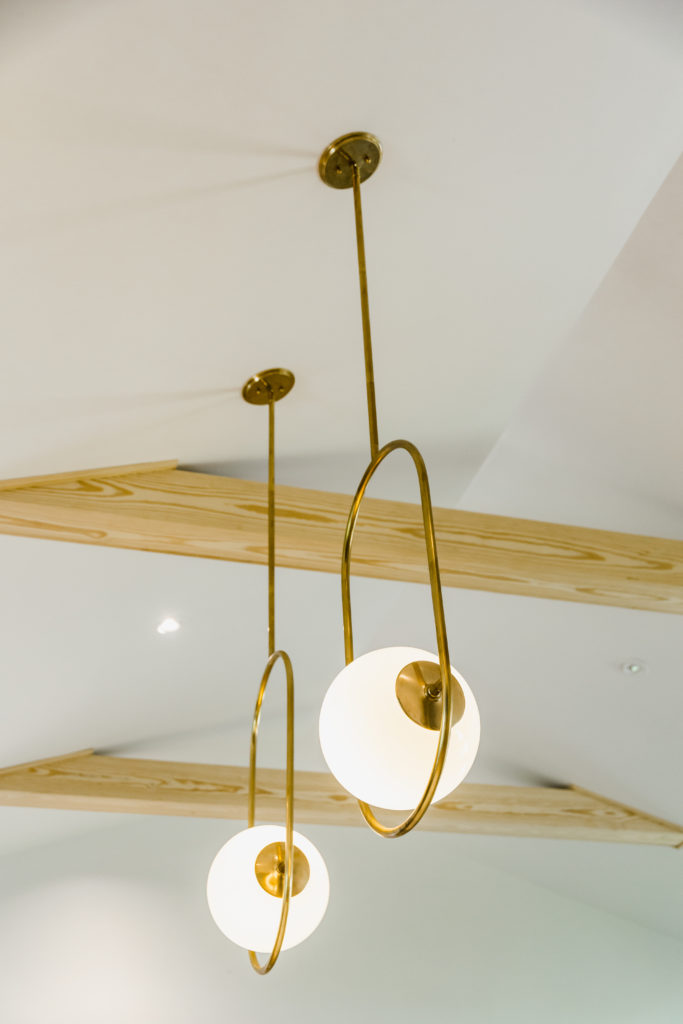
If you’ve ever looked for lighting you know how many choices there are out there and it’s very overwhelming! We finally decided on these pendants designed by Martyn Bullard for Corbett Lighting. They combine vintage & modern effortlessly and exudes luxury. The design was inspired by a pair of earrings Elizabeth Taylor once wore. So chic!
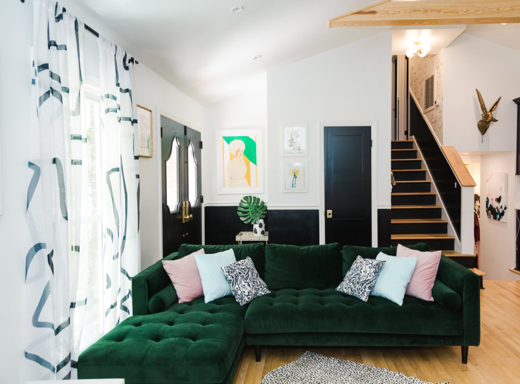
Last year I painted the bottom of my front doors and walls in the entryway Sherwin Williams Tricon Black to match the doors and cabinets. It’s the the perfect contrast with the rest of the white walls.
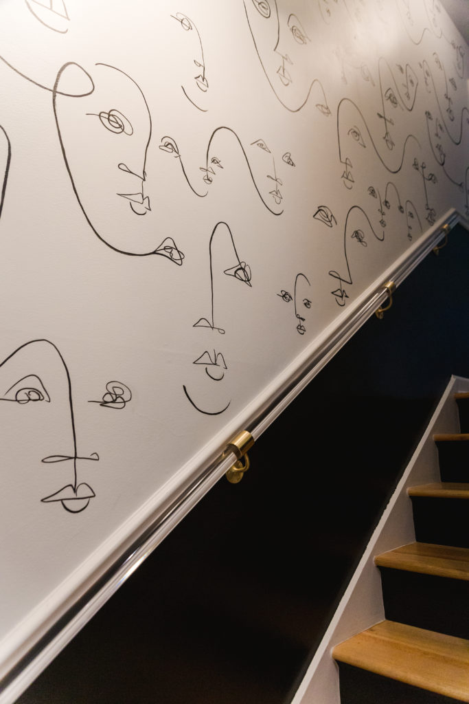
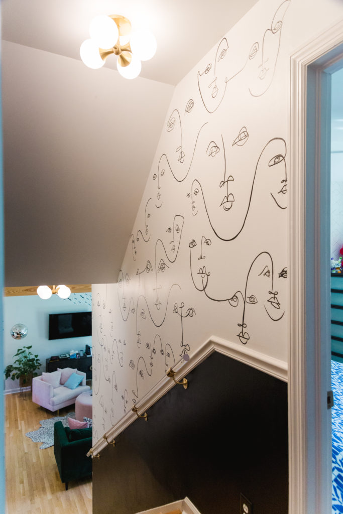
I love art and I always knew I wanted a custom mural from my friend Carrie Beth Waghorn. I love her fluid, organic style and I’m obsessed with her faces and the celebration of the female form.
At first my boys weren’t into the idea of faces painted on the walls, but once the project was complete they warmed up to it.
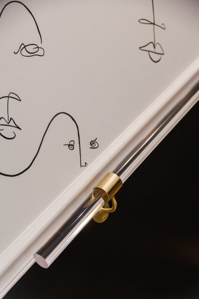
We had a boring wooden hand rail on the wall and I always wanted to have a more interesting accent. Enter Luxe Holdups.
I found them on Etsy thanks to my design consultant Lauren Larowe. The lucite handle and brass fixtures instantly dresses up the space and make it look, well more luxe! Our ceiling lights by Hudson Valley Lighting has the perfect retro touch.
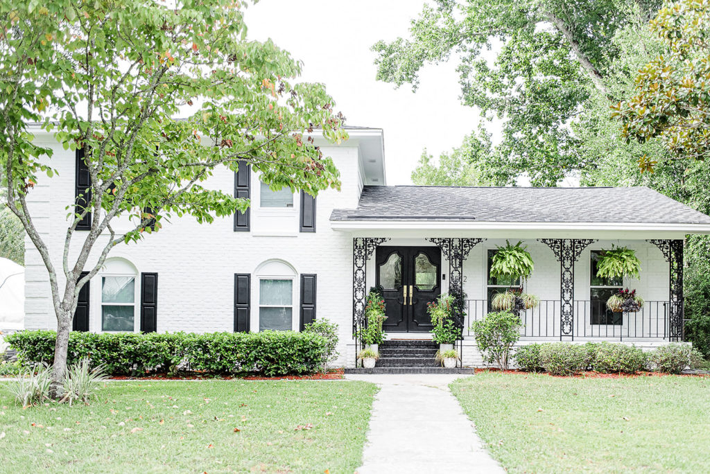
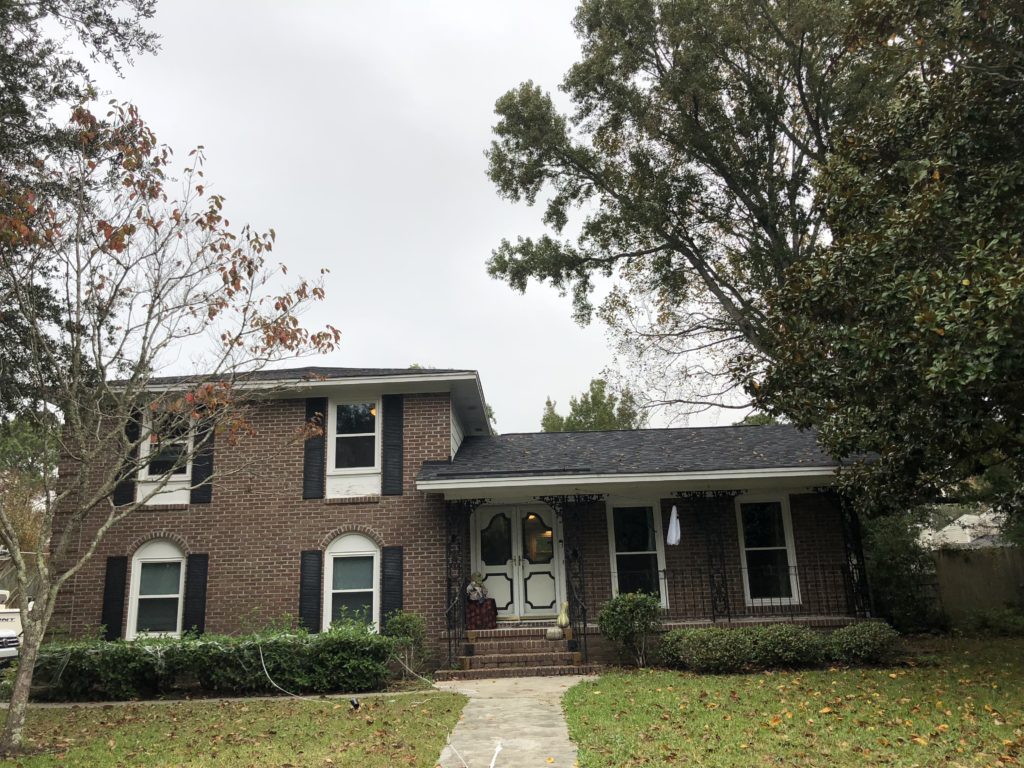
Last year we finally did the final big transformation by painting the exterior of our house. Swimming through a sea of whites we chose Sherwin Williams Alabaster White.
It looks like a completely different house and the original black wrought iron really pops against the white brick. We still have more interior tweaks to do but I’m so happy that all of the big stuff is done. Now we finally have the house that reflects our personality!
We Love the Transformation After Renovating Our 1960s Brick Ranch
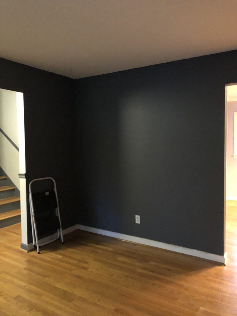
Here are the before’s. I still can’t believe this was the same house!
CATEGORY
1/06/2022
It was such a FUN time working with you! You are so talented and one of my favorite humans ever! Cheers to a wonderful 2022 my friend!